AnandTech Mobile: Pinch to Zoom & Pipeline FP Now Supported
by Anand Lal Shimpi on July 16, 2013 6:10 PM EST- Posted in
- Site Updates
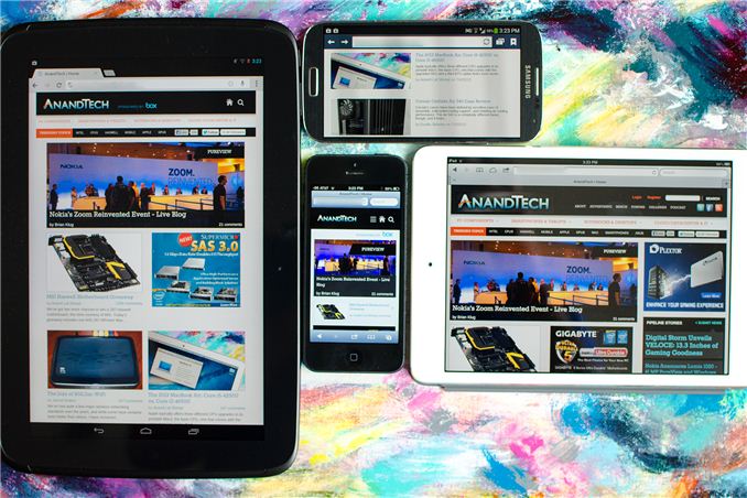
Yesterday, with the help of our friends over at Box, we launched the first responsive version of AnandTech. To recap, our single site design will now present you with one of four different views depending on your browser's reported resolution (not user agent string). You'll get a smartphone portrait, smartphone landscape, tablet or desktop view depending on what resolution your browser supports.
Based on your feedback from Monday our developer John has added a couple of additional frequently requested features:
1) Support for Pinch to Zoom is now enabled in the mobile view.
2) The most recent 8 Pipeline stories are now integrated on the front page (all other front pages had them integrated already).
Next on the list are higher res icons :)


 Facebook
 Twitter
 RSS
RSS


20 Comments
View All Comments
kyuu - Tuesday, July 16, 2013 - link
Excellent. Thanks for being so responsive to the feedback!skiboysteve - Wednesday, July 17, 2013 - link
I see what you did thereZandros - Tuesday, July 16, 2013 - link
Yay! Thank you!bobbozzo - Tuesday, July 16, 2013 - link
Hi,I noticed this earlier today (about 5 hours ago); I'm not sure if that was before or after the zoom changes:
The new design mis-detects my laptop as a mobile device.
OS: Fedora 17 64-bit
Computer: Dell Latitude e6410 laptop
Screen res: 1440x900
Browser: FireFox 22
Furthermore, I get an error when clicking About - Show Full Site (it does work though, despite the error).
Anand Lal Shimpi - Tuesday, July 16, 2013 - link
Is your browser running full screen? What error do you get?aryonoco - Tuesday, July 16, 2013 - link
Yes it is also mis-detecting my desktop as a mobile device.22" monitor with a 1680x1050 resolution
OS: Ubuntu 12.10
Browser: Chrome 28 running full screen
aryonoco - Tuesday, July 16, 2013 - link
Show full site worked fine for me though.bobbozzo - Wednesday, July 17, 2013 - link
Hi,It was full-screen except for the Gnome 3 'start bar' at the top of the screen.
I don't remember the exact error message, but it was something like "request failed". It did work though.
thanks
Devfarce - Tuesday, July 16, 2013 - link
Really loving the mobile theme, however one thing I noticed is the iOS webapp/springboard icon functionality will load the page in fullscreen mode without Safari controls for the home page however clicking on any link will exhibit a multitasking switchover to regular Safari. It looks like apple-mobile-web-app-capable meta flag may not be implemented on all pages which causes the switch to mobile Safari.summat - Wednesday, July 17, 2013 - link
iOS constrains websites using 'full page' loads from home screen icons to a single 'page' meaning you can't link to other pages, only change anchors at the end of the URL - like after a #.All navigation must be done using asynchronous requests, otherwise it'll do exactly what you see there, which is load the initial page as a full screen site without address bar/controls but then push you back into full Safari as soon as you hit a link. I guess the site isn't quite fully Apple'd in doing navigation on mobile quite yet.
Still, works nicely on my Nexus 4 :) Great work!