The Corsair Gaming K70 RGB RAPIDFIRE Mechanical Keyboard Review
by E. Fylladitakis on July 1, 2016 8:00 AM EST- Posted in
- Peripherals
- Corsair
- Keyboard
- Cherry MX
- Mechanical Keyboards
- RGB

As with every market that goes through a sustained period of significant growth, the market of mechanical keyboards is becoming heavily saturated. There already are dozens of companies offering literally hundreds of mechanical keyboards, covering nearly all shapes and sizes in the process. Designers try to innovate and differentiate, which lead to features such as RGB lighting and modular key switches, but this becomes exceedingly difficult as the number of companies and products continue to increase, especially since there's only a small number of mechanical key switch designs to build keyboards around.
Therefore, several companies are now trying to innovate on the design of the mechanical key switches themselves, and we are starting to see new switch designs coming into production in 2016. The first few new designs came from Chinese/Taiwanese manufacturers, but the high demand has meant that the older and larger players would not stay idle either.
One of the first and largest players in the mechanical keyboards market is Corsair. They slowly entered the market with just a single keyboard, but it was such a great success for the company that they soon founded Corsair Gaming, a sister company focused on marketing and selling gaming-related peripherals. Corsair’s great success is heavily attributed to their exclusive deals with Cherry, the most reputable manufacturer of mechanical key switches. For example, they had an exclusive for Cherry MX RGB switches for a year, which made the K70 RGB one of the most popular top-tier gaming keyboards last year.
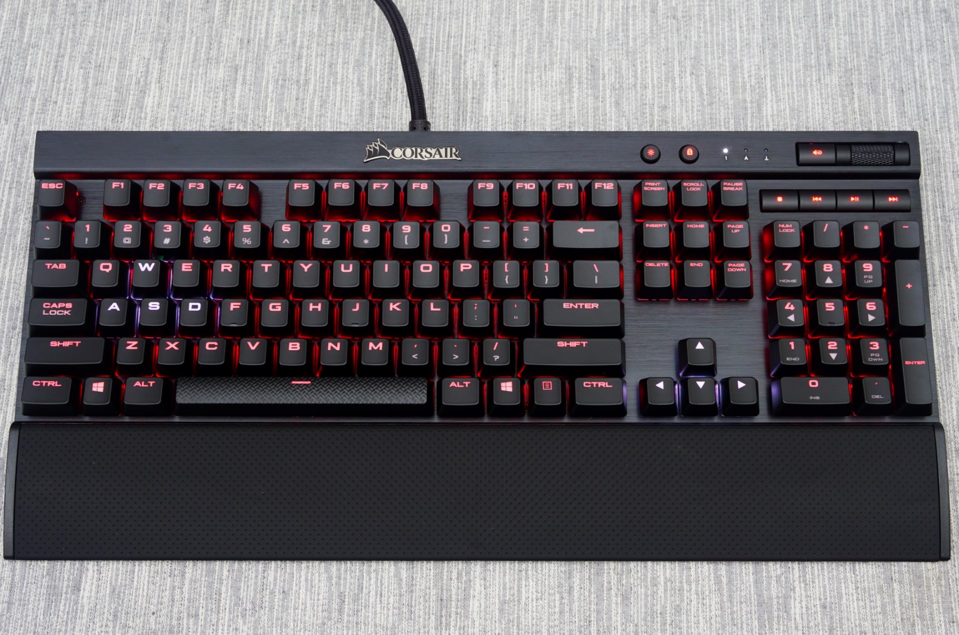
Today we are having a look at the K70 RGB RAPIDFIRE, the keyboard born from another exclusive deal that Corsair has made with Cherry’s new mechanical key switch, the “RAPIDFIRE”. It is a switch designed specifically for gaming by combining light actuation force and higher actuation speed. On paper it does sound interesting, and today we'll put its design to the test to see if there's any actual improvement over Cherry’s “classic” designs.
Packaging and Bundle
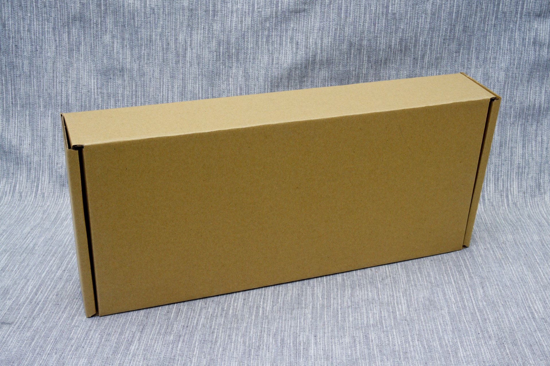
We received an early production sample of the keyboard so Corsair did not have its exterior packaging ready yet. It will most certainly be dark with yellow accents, aesthetically focused on a picture of the keyboard itself, like every other keyboard packaging they produce since 2014. The cardboard packaging is very strong and offers more than sufficient protection to the keyboard during transport.
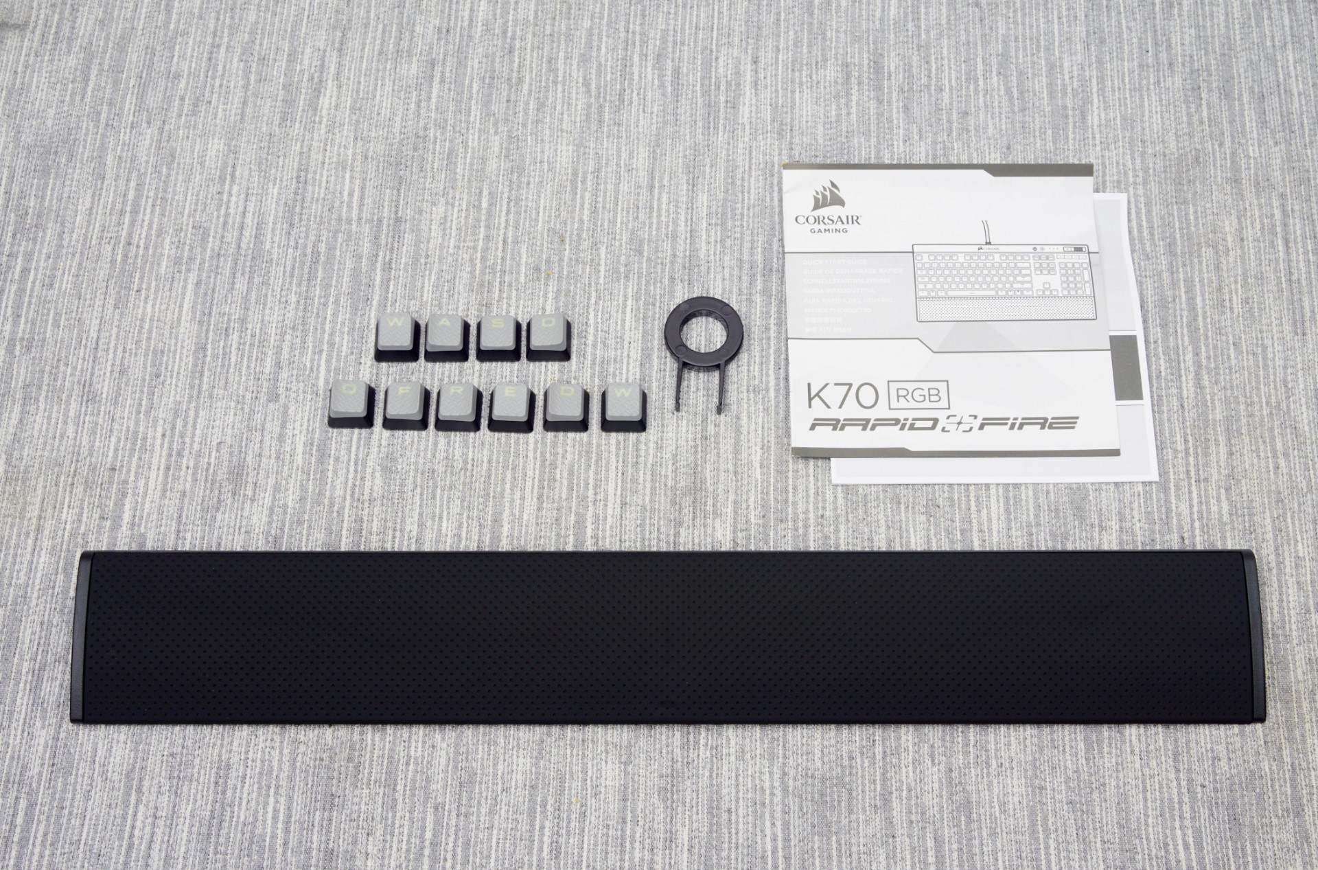
Inside the box, we found a couple of basic quick-start and warranty leaflets, a set of extra keycaps and a full size wrist rest. The wrist rest has a corona-treated surface that gives it a soft, comfortable rubber-like feeling. The extra ten keycaps have contoured, textured top surfaces, assisting tactile feedback when gaming. The first set is supposed to be for FPS gamers and the second for MOBA gamers. Both sets are contoured and textured. Two keycaps, the W and the D, exist in both sets but have different contours as a result.


36 Comments
View All Comments
Omega215D - Friday, July 1, 2016 - link
This is why I felt the Romer G and SteelSeries low profile mechanical switches are quite good for quicker actuation and, for the Romer G, tactile feedback for typing purposes. The only thing that annoys me with Logitech's Romer G keyboards are the lack of on-board memory so that I can store settings without having to fire up LGS. The SteelSeries Apex m500 is just priced way out there to justify a purchase but it felt good to type on.JoeyJoJo123 - Friday, July 1, 2016 - link
Then use O-rings to prevent bottoming out your standard profile keys?wsjudd - Friday, July 1, 2016 - link
I agree, o-rings are a much cheaper solution than buying a new keyboard with new switches, and they work on every keyboard :)ddriver - Friday, July 1, 2016 - link
I guess they put a blind man in charge of selecting the font on this oneMargalus - Friday, July 1, 2016 - link
I wish more companies would use blind people then. That the best font I've seen on a keyboard in years.ddriver - Friday, July 1, 2016 - link
15 years of graphics and print experience say the font is mighty fugly and disproportionately stretched. You either haven't seen all that much keyboards or you have no notion of aesthetics.ddriver - Friday, July 1, 2016 - link
Font spacing on keys that have more than one character is very bad too.Margalus - Friday, July 1, 2016 - link
I've probably seen a lot more keyboards than you have, and I do have a notion of aesthetics. Just because my opinion is different than yours does not make it any less valid. The font is smooth, large, and easy on the eyes.inighthawki - Friday, July 1, 2016 - link
I'd have to side with ddriver on this one. The font looks pretty ugly to me -- The letters are way too wide and bold, and have a pretty nonstandard (almost "gamer") design to them. And while I personally don't mind it, ALL CAPS HAS BEEN KNOWN TO BE A FAIRLY BAD IDEA for labelling things.ddriver - Saturday, July 2, 2016 - link
It is not just "gamer" it is "shitty 80's game" written all over. The font is obviously stretched far beyond the intent of the designer. Spacing is too small. Zero design skill, I'd fire that guy... out of a cannon.