The Android 5.0 Lollipop Review
by Brandon Chester on December 1, 2014 10:00 AM EST- Posted in
- Smartphones
- Android
- Tablets
- Android 5.0
Google Fit
Google Fit was launched at Google IO, as an answer to other health systems put forth by Apple, Samsung, and other companies. Much like Healthkit and the Health app on iOS, Google Fit is a set of APIs and services which is accompanied by the Fit application on your Android device. With Lollipop on the Nexus 6, Google has included Fit by default as an application that cannot be uninstalled, which may be to the annoyance of users who don't really care for fitness applications.
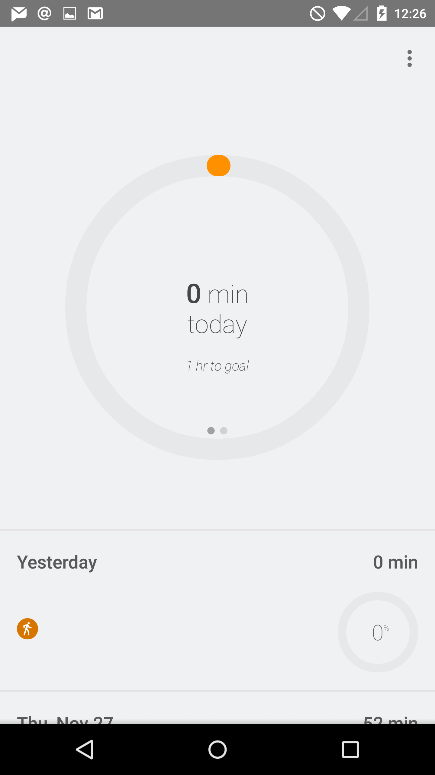
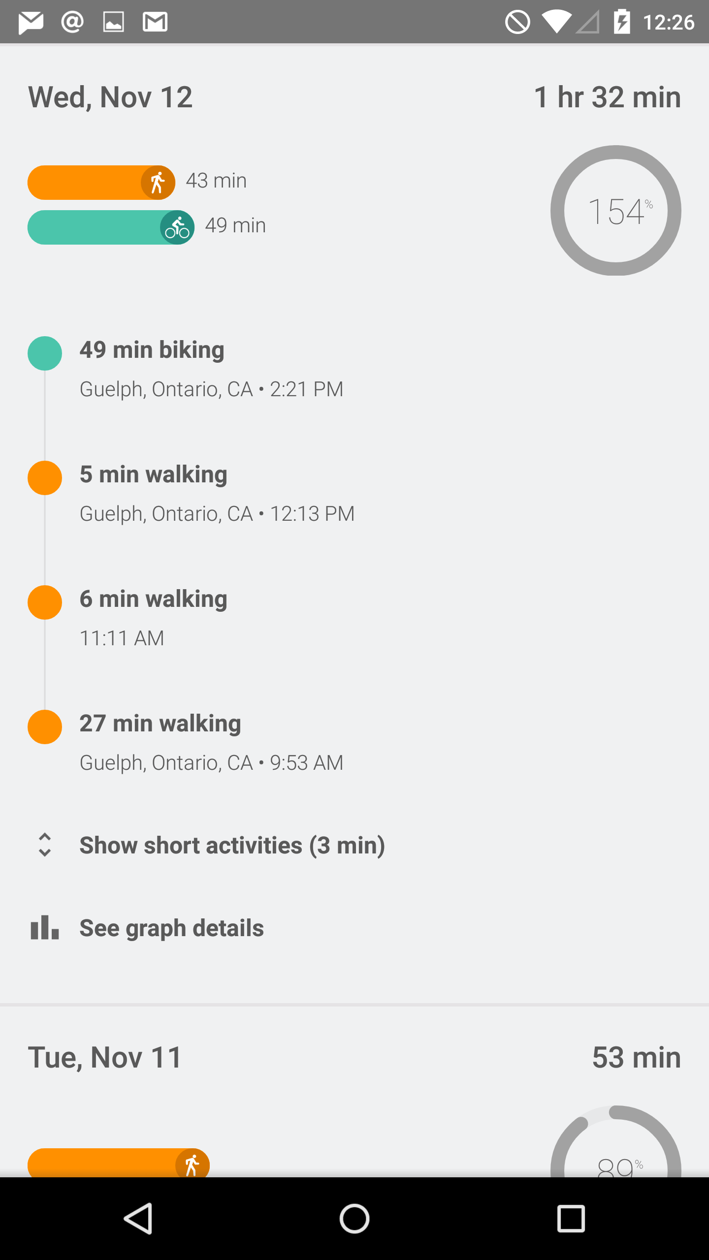
That being said, there are obviously quite a number of users who do use fitness applications, as the list of fitness applications and initiatives from both first and third party developers is growing rapidly. The distinction between health and fitness applications should probably be made here, as while Apple's Health app can track and store things like medical information, applications like Fit are limited to tracking exercise. As you can see above, the application is organized as a list of dates, with information about your fitness activity on each day. You can specify a goal for the amount of time you want to spend exercising, and the application will send you a notification when you reach it. The tracking is done by monitoring the various sensors in your device, and you can also input information manually if you prefer to exercise without your phone. I'm not really big on exercise, but during my time using the app it seemed to work reasonably well. I did notice it can sometimes categorize time spent in a vehicle moving slowly as time biking, but that's really just a limitation of how the information is being tracked.
Updated Applications
Contacts
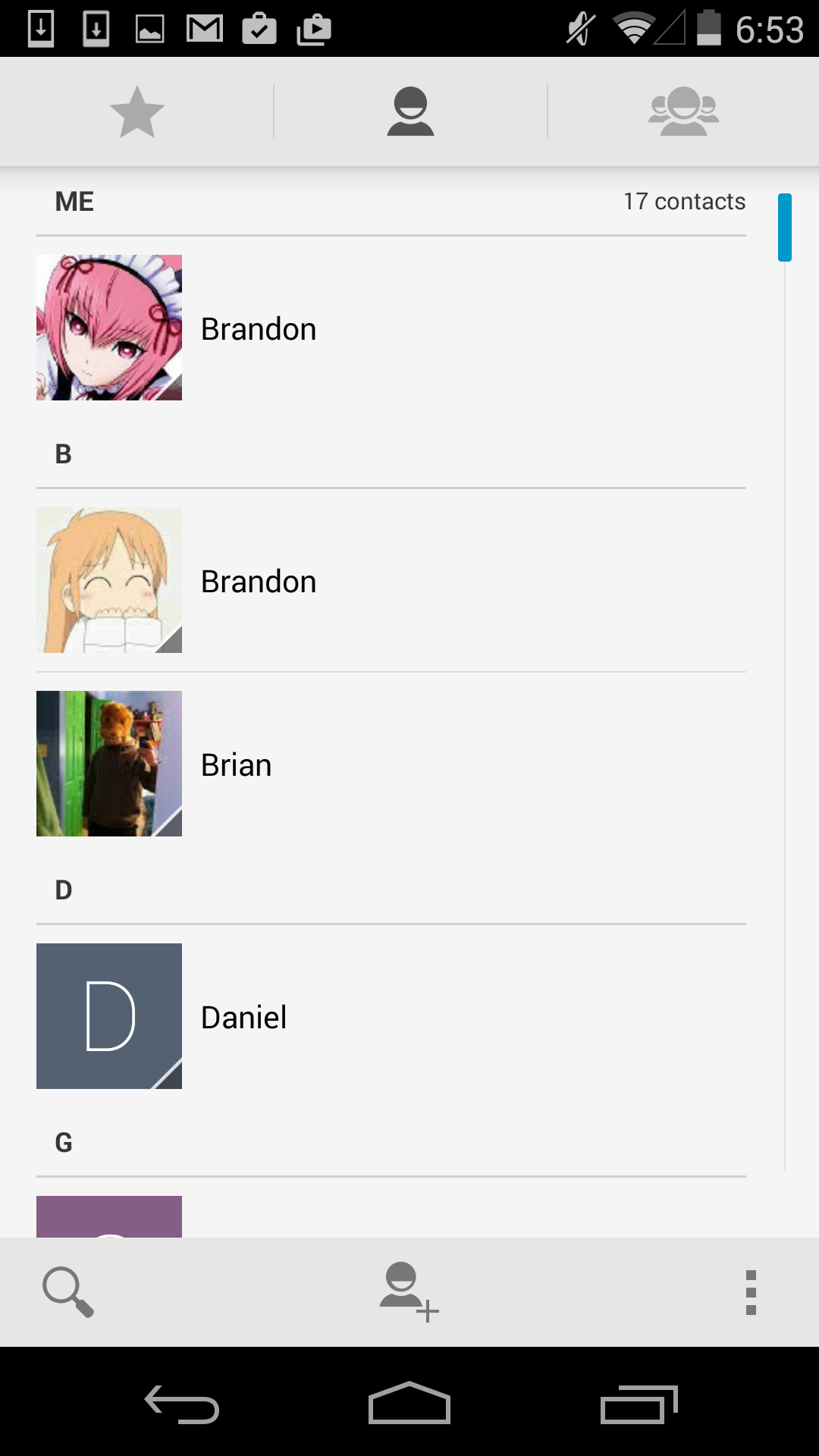
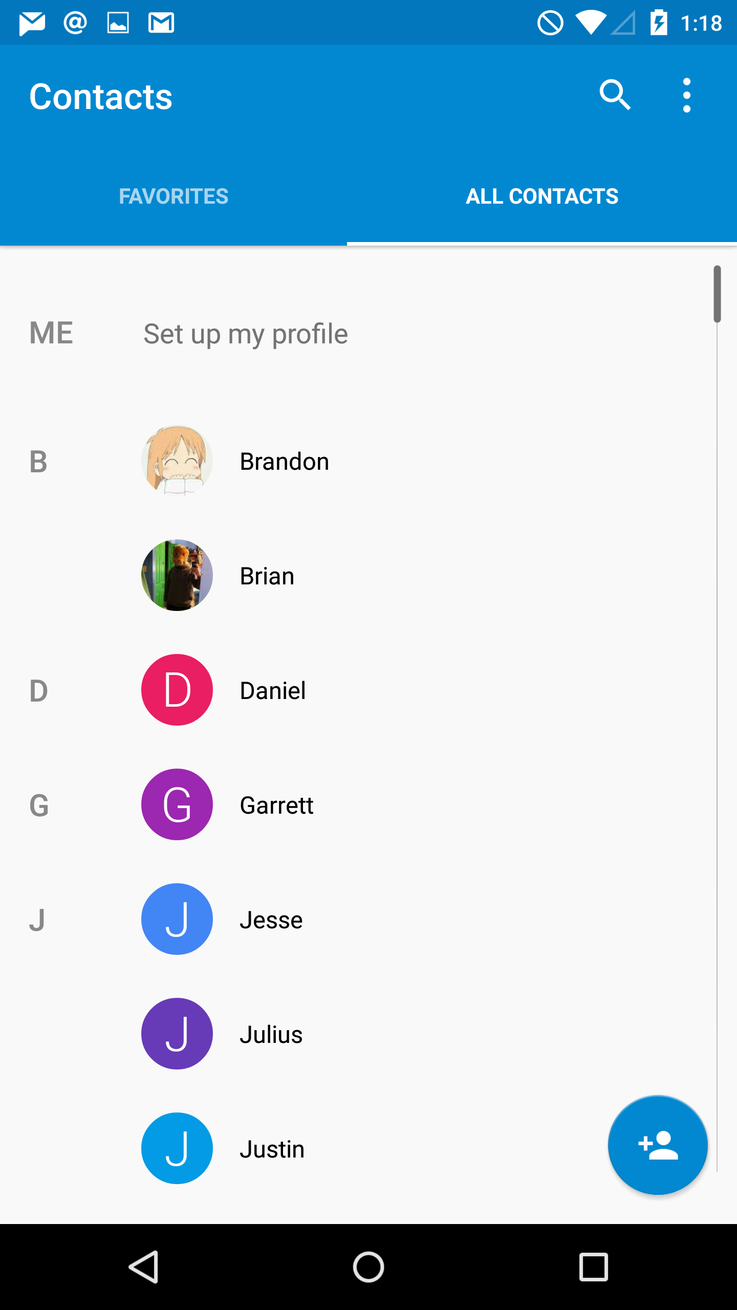
The People application has become Contacts in Android Lollipop, and the design is greatly improved from what was quite frankly an awfully designed interface. As you can see above, Google has given the interface a blue accent color and adopted the circular contact photo style that we've seen on other platforms. They've also cleaned up the interface significantly by consolidating the controls into the top part of the application, and by removing unnecessary parts of the interface like the lines that separated the contacts into sections based on their initials. These changes also improve usability significantly because the simplified interface is now made up of only two sections which are clearly labelled by their name, rather than by 3 icons that do not make it obvious what each section contains.
Calculator
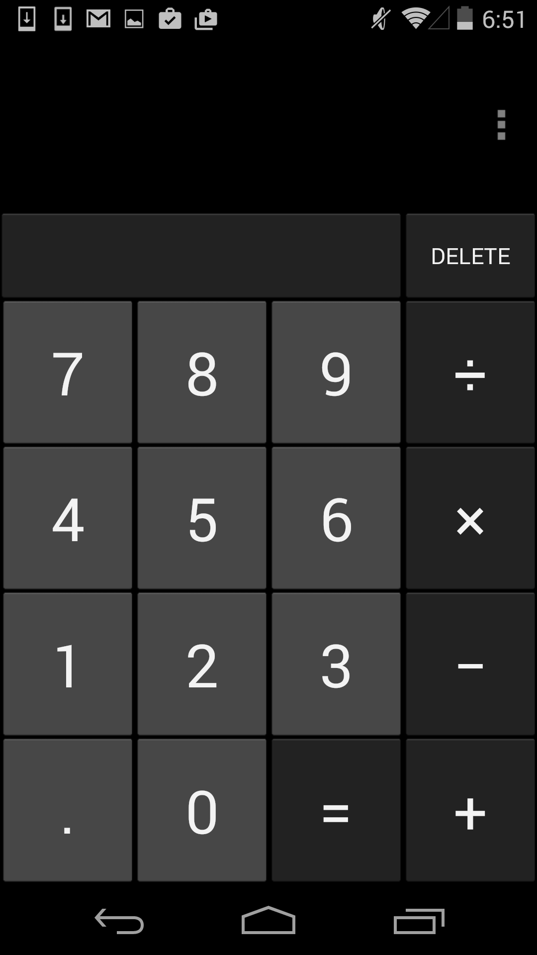
The calculator application also receives a complete visual overhaul in Lollipop. Much like the keyboard, Google has done away with the separate visual keys for each button in the calculator, allowing them to simply float atop a solid colored background. This also allows them to not be constrained by the rules of a virtual grid, which has made it possible to move the delete key downward in the row with the basic math operators. This change means that there's no longer an empty rectangle above the keypad in portrait mode, and more space to enter numbers and operators in landscape. You can also see above how the edge of the overlay with trigonometric, exponential. and logarithmic operators is visible on the right side of the main part of the application, which lets the user know that there is something to the right that they can pull on.
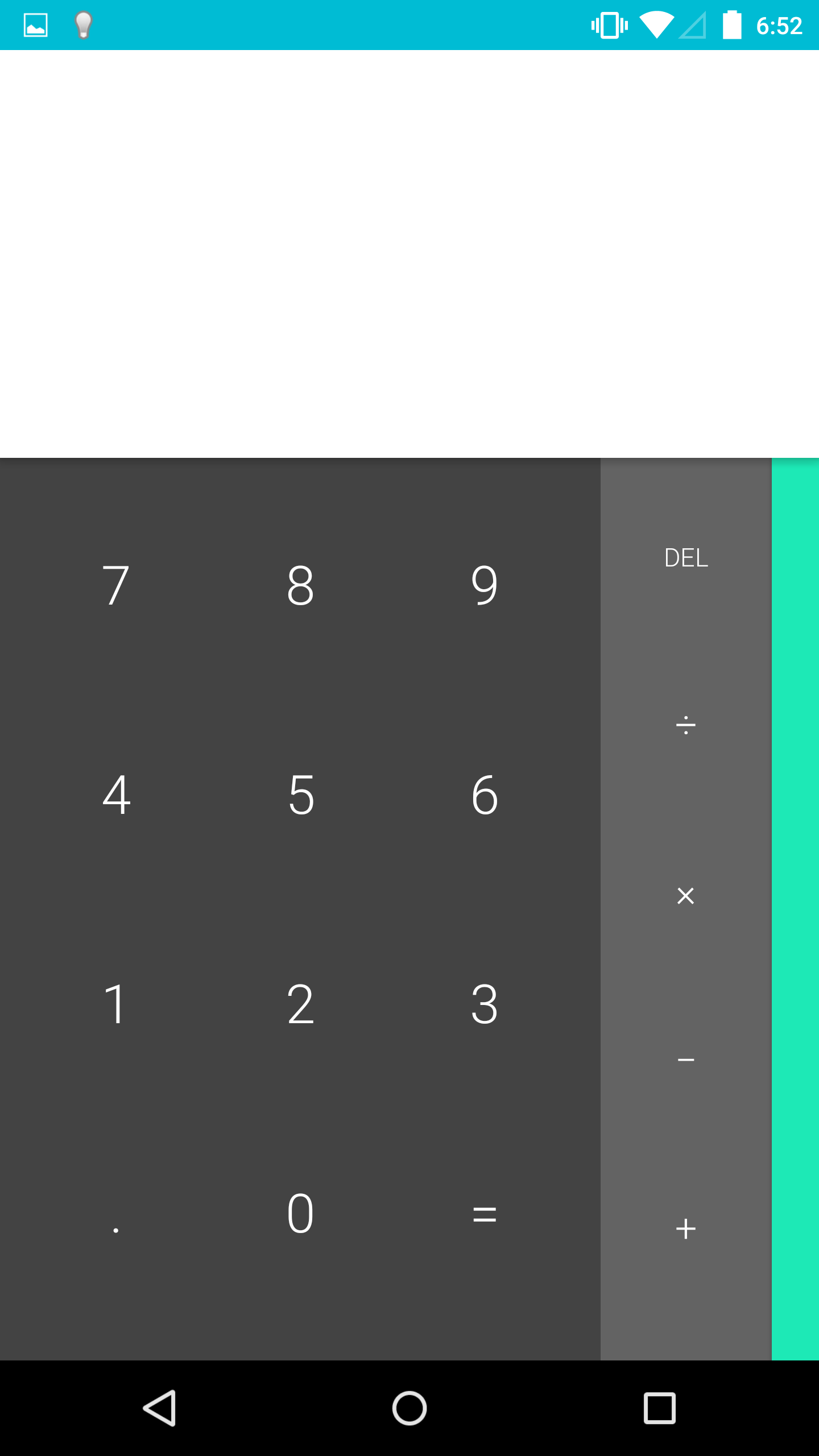
Google has also greatly improved the landscape view. In the previous version, switching to landscape simply put two buttons for parentheses alongside the numerical keys, with the more advanced operators still in a section that you would have to swipe to. This layout didn't do a very good job of taking advantage of all the horizontal space available in landscape mode. With the calculator in Lollipop, the landscape view shows every button in the calculator on a single screen, separated into three separate colored sections. This is a good improvement, although I think it would be helpful if Google implemented some more features, like dedicated keys for the cubic and cube root functions.
Messenger
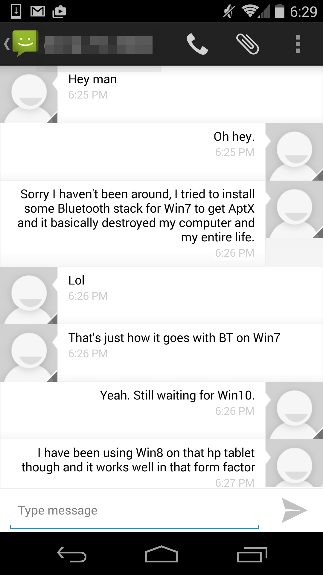
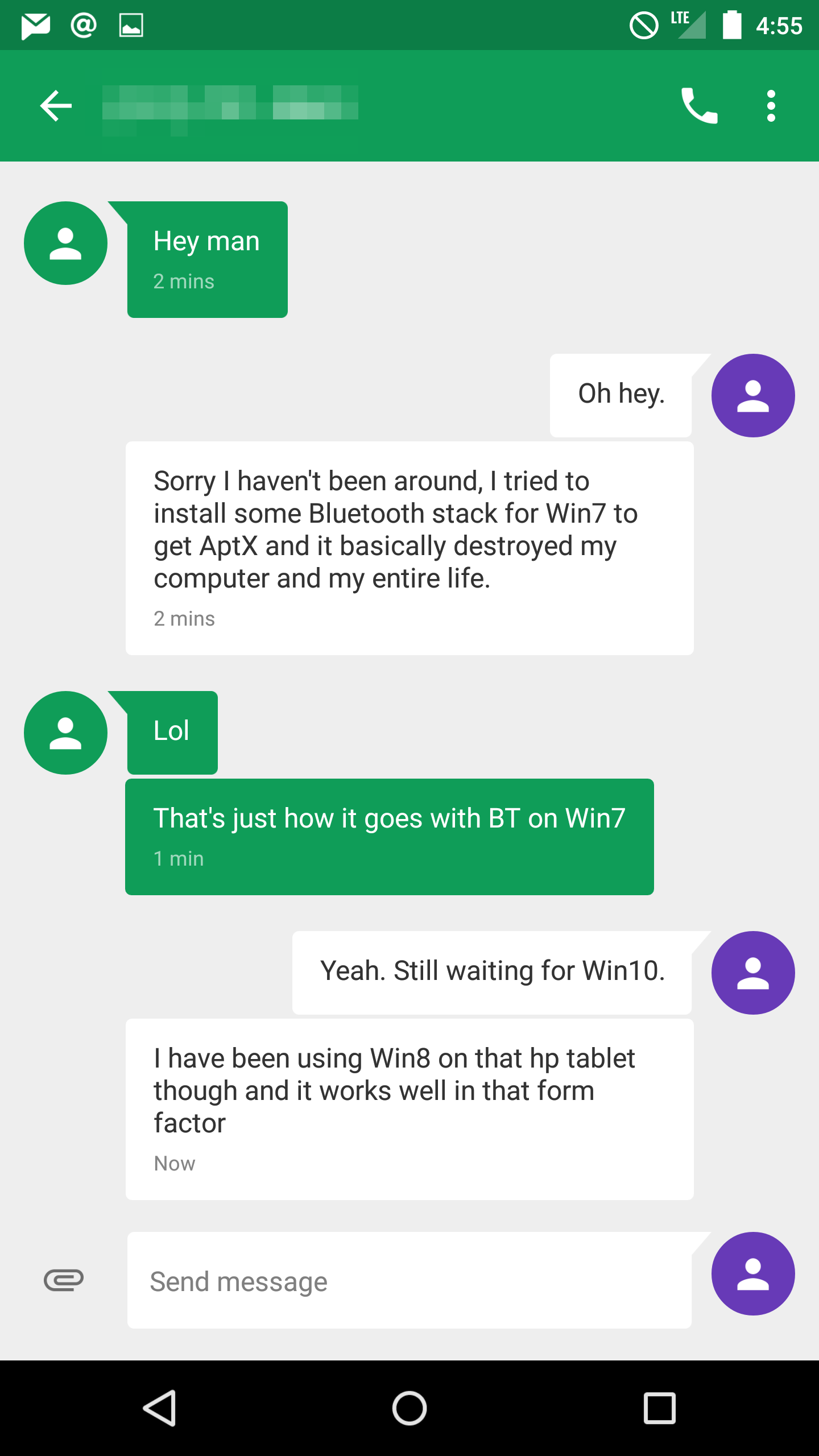
For a long time, I thought Google had just forgotten about the Android Messaging application. It seemed like users were being pushed toward using Hangouts as their SMS application. Lollipop brings an unexpected new application called Messenger, which is like a better version of the AOSP Messaging app. This is a good example of how what people think of as stock Android on a Nexus device is not really stock Android in the sense of using everything from AOSP. It should be noted that the Nexus 5, which never had the AOSP Messaging app, does not get the Messenger app when upgrading to Lollipop.
Messenger is also an interesting example of an application actually using more grey in Lollipop than in KitKat. The application uses a grey background, with white speech bubbles for messages you send, and colored ones for messages you receive. The color of the receiving ones can depend on if you have a contact photo assigned for the person you're texting or not. If you don't, it sets a random color for the speech bubbles. This makes for an interesting dynamic interface, but it can sometimes result in bright pink conversations that may be unwanted.
Google has also made some interesting changes to adding attachments for MMS messages. The paper clip icon has been moved beside the field for entering your message, and tapping it brings up an in-app camera interface that allows you to quickly take a photo of something and send it. Swiping upward expands the camera preview to the entire size of the display, and tapping the check mark takes a photo of whatever is in view. Google also also added an interface for the Photos app which behaves in the same manner beneath the text input field, and there's now a microphone button for recording and sending audio messages.
There are many more updated applications in addition to the ones I've discussed here, some of which appear in other parts of the review. Some applications which have been redesigned are very similar to their KitKat counterparts, but with new color schemes and small changes to header bars and buttons to fit in with the new Material Design style. Overall, I'm very happy with the updated applications in Android Lollipop. Truly redesigning an operating system requires a lot of work, and a lot of planning. For the most part, Google has avoided creating any inconsistencies by leaving in parts of the interface from older versions of Android, and it results in a new design that feels very thoughtfully created and implemented.


126 Comments
View All Comments
tralalalalalala40 - Monday, December 1, 2014 - link
iOS users welcome Android users to 2015, only 8 years late on a smooth UI!Better late than never. Consumers win!
blzd - Monday, December 1, 2014 - link
Didn't iOS just get the ability to install a custom keyboard? lol fanboys.ruthan - Monday, December 1, 2014 - link
Im still waiting for PC support - with app in window mode and multimonitor support and virtualisation and more PC HW drivers. They already have x86 build for tablets, even small 1 man project Android-x86 is now number 8 on linux distrowatch.Linux is dammed (something wrong fix it from terminal.. is show stopper for normal user) but Android could be way for good free desktop PC, users already know how to use it.
HackerForHire - Monday, December 1, 2014 - link
I was hoping for a paragraph or 2 on the improvements in low latency audio. It's unfortunate that audio always seems to be left out of the mix for most OS reviews.tuxRoller - Tuesday, December 2, 2014 - link
Look at reddit for this. Folks have adjust tested it and it still isn't usable (midi to USB).The system audio latency hasn't changed, iirc.
Regardless of I/o talks Google simply doesn't care about either audio or low touch latency.
BobSwi - Monday, December 1, 2014 - link
Didnt care for it, actually was the main factor in trying out rooting my Nexus 5. Flashed Kitkat and then Slimkat 8 in less than 2 hours from never having done it before.REBERY - Monday, December 1, 2014 - link
Odd that you would do an entire review on Android and miss arguably the single biggest improvement that this OS provides...namely, the ability for "OK Google" to be active at all times (a la Motorola). Having a personal assistant always available is a huge plus.Impulses - Tuesday, December 2, 2014 - link
Kit Kat was already halfway there with the stock launcher (post updates), you could call it up while within any app or with a locked phone if it was charging.pgari - Monday, December 1, 2014 - link
I have yet to acept the Lollipop update in my N5, as I did not like the Calendar update with its new Material Design (lost ofnow in the weekly view you see only six hours per day, forcing you to scroll)As others, I also do not like the mostly white background neither the lost of the separate keys in the Keyboard and Calculator (as shown in this review)
Brandon,
Regarding ART, you mention that it stores a pre-compilation after the first use of the application, so reducing the available storage space, but did not quantify by how much.
dblkk - Monday, December 1, 2014 - link
The more I read about lollipop the less interested I am, and the more I hope Samsung doesn't force the upgrade on my Note 4.Everything moving to white instead of black is a huge one for me. As a Note 4 owner/user, blacks are my batteries best friend, and as a 30yr old I feel black background white text is easier on the eyes, especially in a darker environment.
I also see a lot of the specific apps that are coming with lollipop are already available for download in the play store. I've tried them all, mail/calander/messanger and ive still reverted back to samsungs software. Mail is nice, but my main accounts are live and yahoo. The organization and just readability in the 'email' app are in my opinion vastly superior to inbox/mail. Messanger is nice, but I like samsungs messages just a tad better. My common's are on top of the feed, and instead of random colors assigned to people, its all custom and for me set up as a photo for each. The calendar app, I don't see much of a change, and don't care to much about. The app drawer with its transparency on kit cat are much nicer than the white background that just jumps out at you, and the notification center on my note 4 is way more easy and functional than the upgrade will be.
I haven't looked into the 64bit and performance upgrades with lollipop vs kitcat, but I have no issues at all right now, so that's I guess welcome performance boost, but not needed and not going to make me upgrade.
I do really hope that lollipop wont be forced, and if it is that this whole white theme can be brought back to dark. But honestly just don't want to upgrade.