The Android 5.0 Lollipop Review
by Brandon Chester on December 1, 2014 10:00 AM EST- Posted in
- Smartphones
- Android
- Tablets
- Android 5.0
Notification Drawer
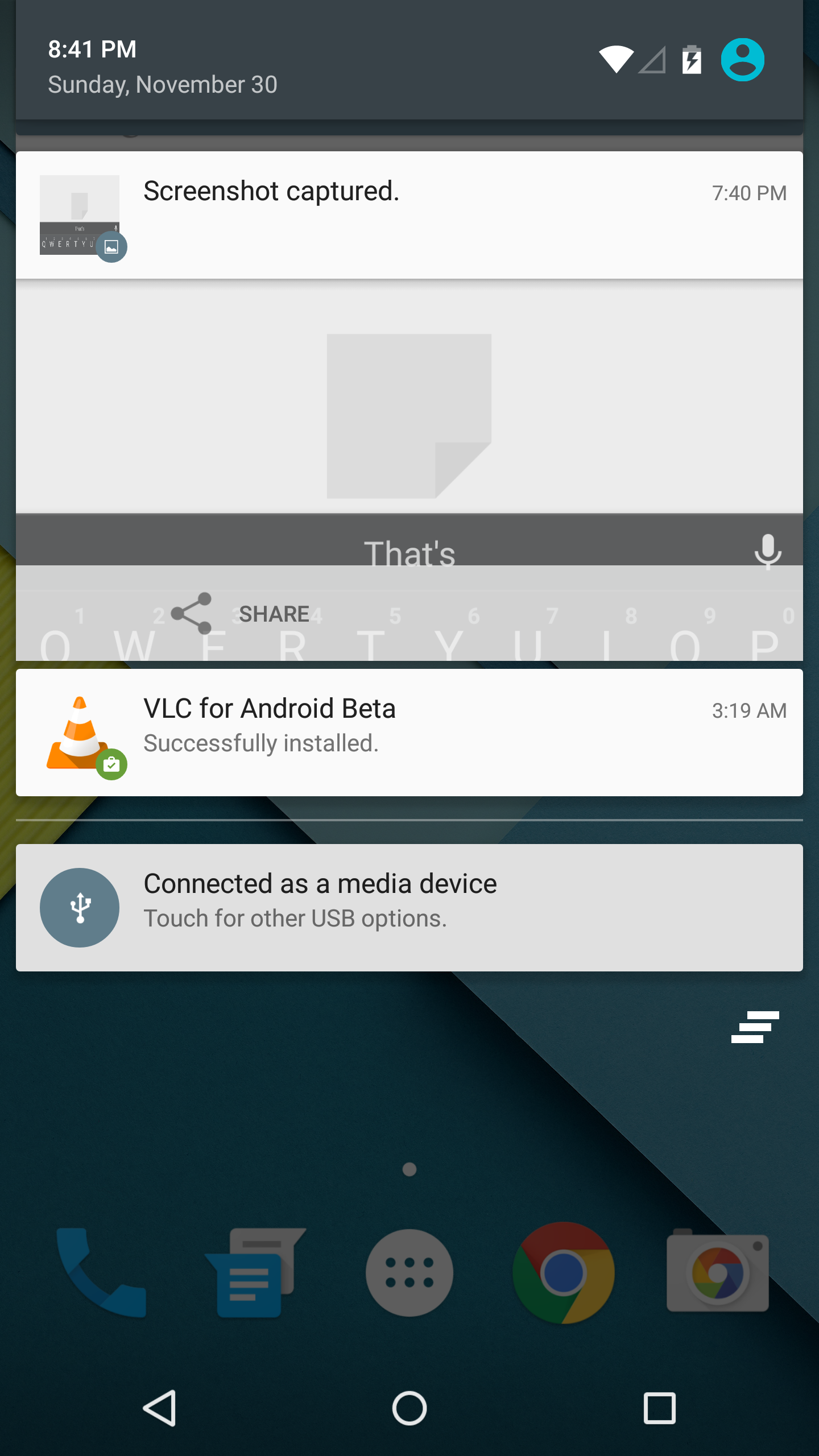
Android was the first of the major smartphone operating systems that we have today to implement the idea of a Notification Drawer. The idea of a screen to store all notifications that can be accessed from anywhere is something that both iOS and Windows Phone 8 have borrowed from Android. Although today it seems like the utility of such a design should be self-evident, it clearly was not, as iOS had previously resorted to intrusive alerts that displayed in the middle of the screen and interrupted the user. The designers behind Android's Notification Drawer certainly deserve a lot of credit for improving the state of notifications on mobile devices. In Android Lollipop the Notification Drawer has been redesigned to display like a list of cards, and has been simplified to include the quick settings page alongside the notifications themselves.
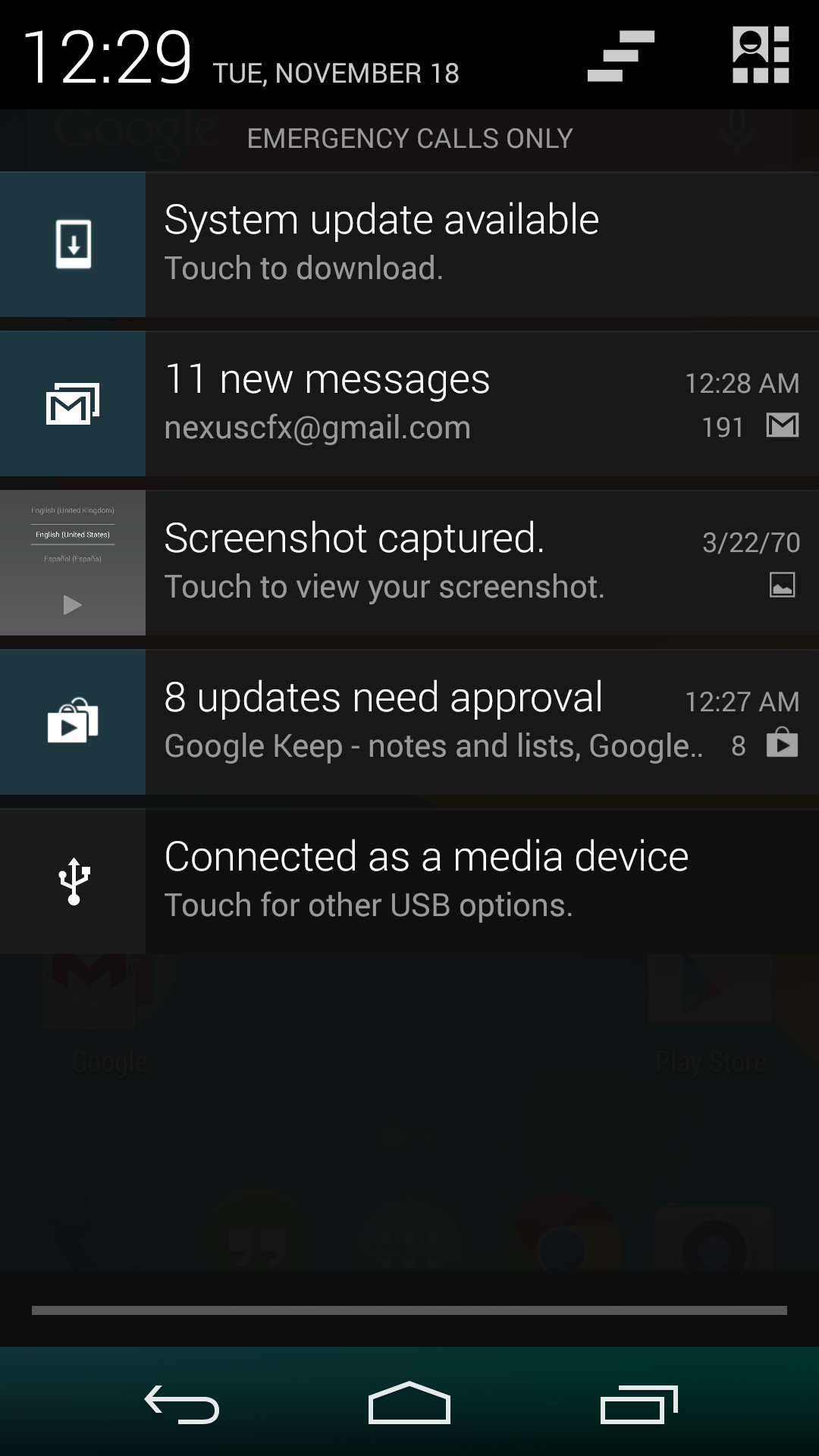
I never quite understood the animation for Notification Drawer in previous versions of Android. If you pull out the drawer in a desk, the first objects you see will be the ones that are closest to the side of the drawer with the handle. This is how the animation for pulling down Notification Centre on iOS functions. But on Android, pulling down Notification Drawer was like pulling down a magic bar that revealed notifications from top to bottom, as though they were already there and the bar somehow revealed them as it went over them. It just didn't really make any sense. In Android Lollipop, Google is clearly displaying each notification as its own separate card, and pulling down the drawer causes them to all expand and slide out from one another. Now it's not much of a drawer, but it's an extremely intricate animation that looks amazing and fits in perfectly with the Material Design aesthetic.
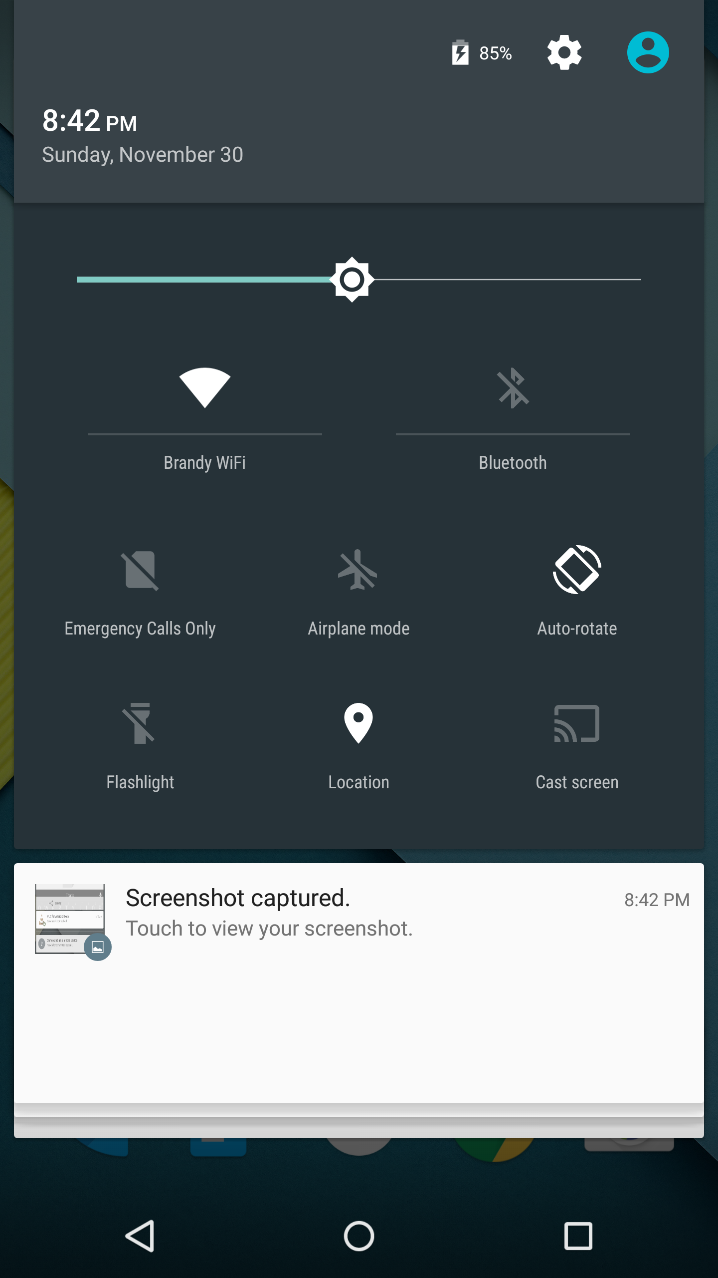
As you'll see above, the quick settings have been integrated into the same section as the notifications themselves. It's now accessed by simply swiping downward a second time after bring down the drawer. I think this works much better than the separate pages that Google was doing previously, which felt more like a way to just throw in quick settings without having to change the design of the drawer beyond the addition of a button. For the most part the settings are the same, but the brightness control is now a slider that can be accessed without having to press anything, and there are a few additions like the Cast screen and Auto-rotate toggles. Google has also finally included a built-in flashlight feature, which may not be welcomed by the developers of ad-ridden flashlight applications, but will certainly be welcomed by users.
The last thing to take note of is the icon in the top right corner. This would normally have your Google avatar, but in my case it's just one of the generic contact icons. Tapping this brings you to the menu where you can add, manage, and switch between multiple user accounts, which is a new feature for phones running Lollipop.
Overall I'm very happy with the new Notification Drawer. It looks better and does more than its previous iteration. My only issue is that it seems that the button to clear all notifications that appears beneath the last notification will not show up if there are too many cards. Swiping upward collapses the list of cards, allowing it to be displayed, but I think Google would be better off just putting it back up top where it was previously so it can always be shown.
Recent Apps
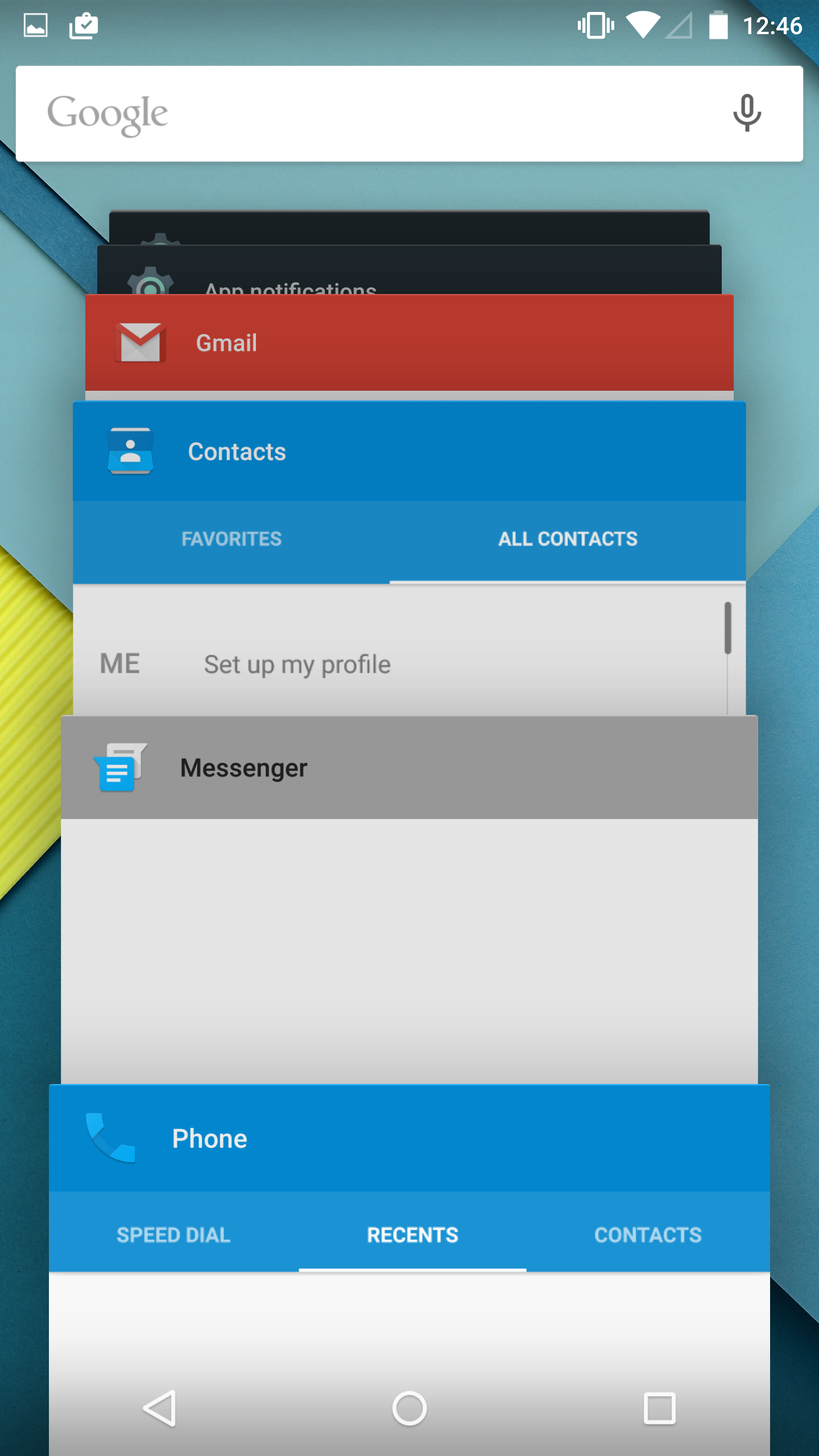
Like the Notification Drawer, Recent Apps also receives a design overhaul in Android Lollipop. What was once a list of square application previews is now something like a stack of cards which displays the full view of every application, although the perspective limits your view to the upper half. The new design also works well with the new animation when accessing it from within an app, which shows the application falling down beneath the navigation buttons and becoming the first card in the stack.
Functionally, it works the same as previous versions of Android for the most part. There is one significant change, and it's specific to Google Chrome users which I would expect is a sizable portion of the Android user base. In Lollipop, tabs in Google Chrome now appear as separate cards in the Recent Apps switcher. This is an interesting move on Google's part because in a way it knocks down a lot of the segregation between native apps and web apps, as web apps will be displayed in the list along with everything else. The only downside to this feature is that it can make it hard to keep track of tabs, and I've actually disabled it in the settings section of Chrome in favor of having the tabs within Chrome itself because I simply have too many tabs open at a single time to have to search for them among every recently opened application.


126 Comments
View All Comments
Impulses - Tuesday, December 2, 2014 - link
I actually prefer dragging twice to the top right button, but that's probably because I use my phone primarily with my left hand. Always thought the quick settings button was much too close to the clear all button tho, despite only hitting clear all by mistake once or twice over the last year or so. I do agree some of the other card stacking and UI choices are questionable tho.toyotabedzrock - Monday, December 1, 2014 - link
Oh and can Google explain why Chrome crashes when sharing to Google Plus via the mobile browser interface? Or why the plus app shate function causes every other app to crash from memory depletion? Also Google search inexplicably crashes on my Nexus 5.Salty Wagyu - Monday, December 1, 2014 - link
Tapatalk has the worst jank, even ART hasn't helped much in this case.sonicmerlin - Monday, December 1, 2014 - link
This talk in Google's 2014 I/O event is very relevant: https://www.youtube.com/watch?v=3TtVsy98cesThe speaker talks about the issues of Android's render thread priority causing lag, and how google worked to fix it in lollipop. I think it starts about 19:30 in.
My main question though is how browsers are affected. iOS and WP browsers scroll every webpage with pixel perfect smoothness, where Android has always lagged and stuttered on heavier web pages. Does Lollipop fix this, or will developers have to code their browsers to take advantage of Lollipop?
lukechip - Monday, December 1, 2014 - link
Lollipop is OK, but I preferred KitKat on my Nexus 10. On Lollipop is seems to take longer / more steps to do the same things compared with KitKat. For example, switching users used to involve:1/ swipe down settings
2/ click on my avatar
3/ enter my PIN
Now it invovles:
1/ swipe down notification tray
2/ click on user icon
3/ select my avatar
4/ drag up lock icon
5/ enter my PIN
The added steps add zero value to my experience. It's just plain poor.
Egg - Monday, December 1, 2014 - link
Frankly, I've been disappointed with Lollipop on my Nexus 5. First thing I noticed was highly visible frame drops swiping between Google Now and the home screen. Dashclock no longer functions. I need to swipe twice to get to the quick shortcuts... why? Meanwhile I haven't seen any improvement in the camera, which is slow to focus even in well lit scenarios... wasn't Camera2 supposed to fix this?Egg - Monday, December 1, 2014 - link
Just tested with GPU profiling, I can routinely get spikes to appear. Yikes!(Also, Google Now's undo toast is not full caps like the updated Photos app undo toast.)
tuxRoller - Monday, December 1, 2014 - link
I really, really wish art had delivered what was promised, but for my sample of three nexus devices (n4,n5,n7-2013) it has unambiguously made things worse. All of these devices were installed using the factory image, and two were fully wiped. It's just awful. Load times are longer. The interface is more janky than its ever been. Battery is pretty much unchanged, however.Google would've really benefited from an additional developer release so as to avoid these issues.
Lavkesh - Tuesday, December 2, 2014 - link
I have infact experienced a drop in battery life. I used to have a screen on time of little over 3 hours on Kit Kat but I havent been able to touch 3 hours so far with Lollipop.Lavkesh - Monday, December 1, 2014 - link
There are still a few areas where the animations do not even do close to 30 fps, let alone 60. The new message application is one example when you tap a conversation and it opens up. That said I do not know why the animations on my iPhone 4s feel smoother. Are they rendering it higher than 60 fps or is it physics?