Color Gamut in Smartphones: Why Bigger isn't Always Better
by Joshua Ho on March 3, 2014 9:22 AM EST- Posted in
- Displays
- Smartphones
- Mobile
Post-MWC, with the launch of at least two of the major high-end flagships in the smartphone space, the basics are becoming increasingly easier to get from OEMs like high DPI displays, the latest SoC, and a plethora of RAM. Therefore, other pieces of the smartphone become increasingly important. One of the most misunderstood parts of the smartphone is a display’s accuracy. Much of this can be chalked up to a lack of existing literature on the subject when it comes to smartphone display quality, which made it easy for subjective evaluation to be the rule.
Of course, even in the PC display space, good displays were incredibly rare because of the race to the bottom for cost. Because reviewers simply didn’t highlight display quality/calibration quality in any objective manner, PC OEMs could cut costs by not calibrating displays and using cheaper panels because people adapted to the color, whether it was accurate or not. The end result was that the early days of the smartphone display race were filled with misinformation, and it has only been recently that smartphone OEMs have started to prioritize more than just contrast and resolution.
Perhaps one of the greatest misconceptions in evaluating display quality is gamut. Many people associate larger gamut with better display quality, but taking this logic to the extreme results in extremely unrealistic colors. The truth, as always, lies somewhere in between. Too large or too small of a gamut makes for inaccurate color reproduction. This is where a great deal of the complexity lies, as many people can be confused as to why too large of a display gamut is a bad thing. This certainly isn't helped by marketing, which pushes the idea of greater gamut equating to better display quality.
The most important fact to remember is that all of the mobile OSes are not aware of color space at all. There is no true color management system, so the color displayed is solely based upon a percentage of the maximum saturation that the display exposes to the OS. For a 24-bit color display, this is a range of 0-255 for each of the RGB subpixels. Thus, 255 for all three color channels will yield white, and 0 on all three color channels yields black, and all the combinations of color in between will give the familiar 16.7 million colors value that is cited for a 24-bit display. It's important to note that color depth and color gamut are independent. Color gamut refers to the range of colors that can be displayed, color depth refers to the number of gradations in color that can be displayed.
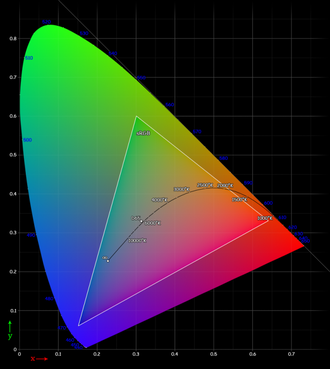
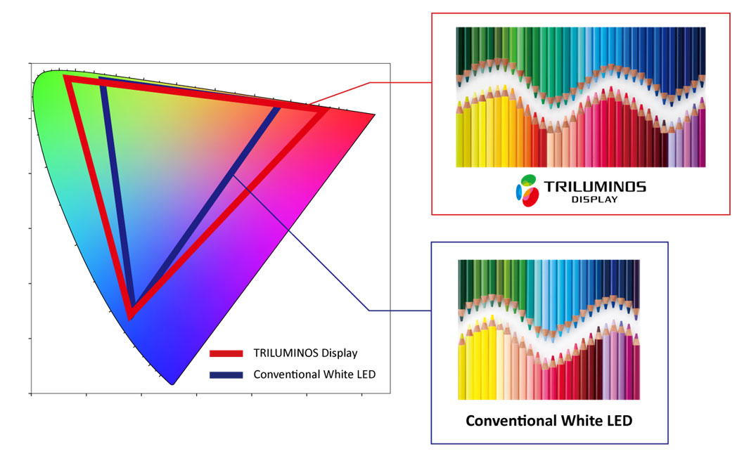
Reading carefully, it’s obvious that at no point in the past paragraph is there any reference to the distribution of said colors. This is a huge problem, because displays can have differing peaks for red, green, and blue. This can cause strange effects, as what appears to be pure blue on one display can be a cyan or turquoise on another display. That’s where standards come in, and that’s why quality of calibration can distinguish one display from another. For mobile displays and PC displays, the standard gamut is sRGB. While there’s plenty to be said of wider color gamuts such as Adobe RGB and Rec. 2020’s color space standards for UHDTV, the vast majority of content simply isn’t made for such wide gamuts. Almost everything assumes sRGB due to its sheer ubiquity.
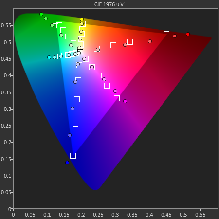
While it may seem that a display with color gamut larger than sRGB would simply mean that sRGB colors were covered without oversaturation, the OS’ lack of colorspace awareness means that this isn’t true. Because the display is simply given commands for color from 0 to 255, the resulting image would have an extra saturation effect. Assuming that the saturation curve from 0 to 255 is linear, not a single color in the image would actually be the original color intended within the color space, and that’s true even within the color space. This is best exemplified by the saturation sweep test as seen below. Despite the relatively even spacing, many of the saturations aren't correct for a target color space.
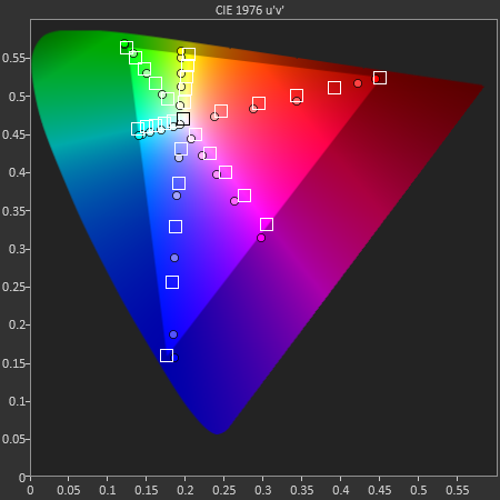
On the flip side, another issue is when the display is constrained to sRGB, but the OEM applies a compression of saturation at the high end to try and make the colors "pop", even though it too reduces color accuracy of the display, as seen below on all but the magenta saturation sweep.
Ultimately, such quibbles over color gamut and the resultant color accuracy of the display may not be able to override the dominant discourse of subjectively evaluated color in a display, and many people prefer the look of an oversaturated display to that of a properly calibrated one. But within the debates that will undoubtedly take place over such a subject, it is crucial to keep in mind that regardless of personal opinion on display colors, color accuracy is a quantitative, objective analysis of display quality. While subjectively, one may prefer a display that has a color gamut larger than sRGB, objectively, such a display isn't accurate. Of course, including a vivid display profile isn't a problem, but there should always be a display profile that makes for accurate color.


57 Comments
View All Comments
melgross - Monday, March 3, 2014 - link
That's not correct. My background includes having run a large commercial color lab in NYC for two decades. So I understand this.So let me say that there are a lot of misconceptions out there. While you are correct about profiles for content, it isn't so simple. The display needs to be characterized as well. You can't make a display that is Adobe RGB 1998 capable into an sRGB display. You can just have the correct profile for it.
But without the OS understanding profiles with built in color management, content profiles won't work. The entire system needs to be implemented. Right now, if a manufacturer has a display that is capable of sRGB gamut, and calibrates it for that properly, even without a formal profile, content that is sRGB, again, even without a profile, will display correctly. No other content, sadly, will.
So unless Apple, Microsoft, Google, etc. can be convinced to implement proper color management in mobile os's, we're stuck where we are. Unfortunately, proper color management is complex, and does require some understanding and interaction with the user to work properly. It's not all automatic, even at this stage.
Even for "proper" computers, only Safari and a couple of other browsers have correctly implemented color management. With the others, anything other than sRGB won't appear correct.
melgross - Monday, March 3, 2014 - link
That's not it. Having a wider gamut with a lower gamut content stretches the gamut of the content to fit the larger gamut of the display, unless proper implemented color management is used, AND assuming the content has a profile.So the results are that every bit of content is over saturated. We end up with orange faces, as an obvious example. That's the problem we see with OLED displays. While graphics can look better, because we have no reference for what they are supposed to look like, photos and videos are all way off. Yes, some people may like that, but it's wildly inaccurate. Remember going into a store with Tv's lined up against the walls? A lot of them are over saturated, and look terrible.
So the problem is that all of this needs to be done all at once. Right now, a display that does sRGB, and is properly calibrated (by the factory, as there is no real way to calibrate a mobile display by the user currently), will have the best overall IQ.
nerd1 - Monday, March 3, 2014 - link
None requires a professionally calibrated display on smartphones - they are commercial products, and they only have to SATISFY the buyers and nothing else.Similarly, you can quantitatively measure the distortion of any audio equipment, but some of highly sought-after amplifiers actually have huge amount of distortion.
Taracta - Monday, March 3, 2014 - link
A bigger color gamut is nearly always better! What the title of this article should be is "Why Display calibration matters" and not something trying to spread FUD about bigger color gamuts. The title of this article could not have been a bigger disservice to the advancement of display technology which have been until recently, mostly regressing.Please have the title of the article at least match what the article is covering rather than some outlier statement.
Anders CT - Monday, March 3, 2014 - link
Wider color gamuts indeed are better, as long as they are a subset of the visible color space.The problem is that the legacy sRGB color space is way too small for a modern quality display, and conforming to the sRGB standard does not make a display accurate, it merley means that the display is well-calibrated for legacy media. The solution is for media-encoders to abandon the awful sRGB standard and adobt a better.
theSuede - Tuesday, March 4, 2014 - link
I would like to add that the article totally lacks one of the more important aspects of real-world image viewing and perception on portable devices. The measured colorimetrical data is only valid for one viewing condition - and that is often a very dark, sometimes totally blacked out surround, zero glare. This is in no way representative of how most people use their devices!Look at the definition of sRGB. It is coded for a surround illumination of 64lx and a glare of 1% - this is at least ten times less than what a typical phone or tablet is subjected to.
Absolute accuracy demands absolute viewing conditions. In the graphical industry I typically specify working overhead lighting conditions and surround coloring (room/wall colors) to very tight conditions before even STARTING to look at the screen workflow.
A portable device with perfect profiles and a good calibration will be showing VERY incorrect colors in 99% of a normal user's use cases. Due to flare and contrast losses the color saturation will typically be lowered by 50% or even more. And due to the contrast loss, the color accuracy over the brightness curve is even more compromised than the static saturation accuracy...
jlabelle - Tuesday, March 4, 2014 - link
The latest comment from SeannyB, melgross and Anders CT are all correct.In THEORY, wider gamut screen is better like my Dell U2711 27" calibrated screen.
But this is only useful if :
1/ the screen is properly calibrated : none of the existing screen on the market (or almost) are and the tablet are generally very bad. Even an iPad Air (which is the less bad) is far from being accurate (I can't tell you cmparing side by side with my calibrated HP Envy X2 tablet) --> so you need a calibration device and an OS that allow you to do that (MacOS, W8)
2/ you need to have this profile recognized and loaded by the OS and software you are using. As it was mentioned, even on Windows, very few software take that into account : irfanview, Photoshop... and basically only Firefox handle correctly the color (IE do not because it just take care of the point n°3 below but not of using the display calibration profile).
3/ you need to have a software that can read the color space used by a picture (if embedded inside) to transform the native color space to the screen color space keeping the color accuracy.
As can be easily understood, there is a lot of if.
1/ You need an OS that is properly color managed (so not iOS),
2/ you need to have application that are color managed (even on Windows or MacOS, a few of them, including the browser), and
3/ you need to have images that incorporate the color space in which they were taken.
I am using my DSLR in aRGB mode in sRGB, I have a calibrated display (that I calibrate every month as unfortunately, color of the LCD dispaly shift with time) and I am using color managed software but this is quite a pain in the ass outside of my controled environment.
This is why, in PRACTICALITY, especially for phone and tablet which are NOT color manageable (iOS for instance, WP), in order to that the best color accuracy (something that you may wish or not, this is another question), the easiest way is to :
- have a screen where the gamut is the closest to sRGB
- have it properly calibrated. Even if not, we can assume that if the color are evenly distributed from the minimum to the maximum saturation possible which is sRGB for such screen color gamut, the accuracy in between with not be too bad (so no compression of colors like some Androïd tablet).
Doing so, it will ensure that for image on the web for instance or from camera which are taken in sRGB color space (out of the box at least), the representation will be the most accurate.
Bottom line : NO WAY we could advice for higher or lower color gamut screen for phone and tablet (at least Androïd and iOS) at this point in time as the OS / software and not able to cope with a proper color management and this is anyway too cumbersome for 99,9% of the population.
Nota 1 : also, I can assure you that this is really hard to distinguish the extra color of the aRGB color space compared to a sRGB picture. You need to have really some special case to have in a pictures colors outside of sRGB space. This is very difficult to see that reproduce in print. While I am having a workflow where I keet all my aRGB picture to extract the last juice of colors, in all practical purpose, it makes almost no difference in the very large majority of the case.
Nota 2 : as was also mentioned by theSuede, the color calibration only works for a given type of lightning. So you calibrate your screen with outside sun light and then, the color are off when viewing at home with incandescent light. Unfortunately, this is the reference taken for screen accuracy measurement (by Anandtech for instance). And while we are looking a lot our phones outdoor, tablets are much more used inside buildings in darker places and with lights.
For phones, you are a little bit out of luck even if some OS like WP allows to change saturation and white point.
For tablet, there is only W8 tablet that allow to run a display calibration software and probe and therefore, you can enjoy properly sRGB calibrated screen, to the prefered lightning usage but otherwise...
Rdmkr - Tuesday, March 4, 2014 - link
A broader color range is also an objectively positive feature. It makes a greater amount of chroma (color) detail perceptible to the human eye, i.e. raises the "retina" level dpi level for chroma information. Even when a display is inaccurate this is an advantage. Also, sRGB is just a standard, a convention. The convention is dependent on the app used at any time (one can easily write an app with the adobe range in mind, for example, or add a setting for adobe adjusted colors) and can change on a global-community wide level too as screens with a broader color depiction capability become more widely available.jlabelle - Tuesday, March 4, 2014 - link
Seems you do not understand how color management work then... sRGB is not a standard or a convention, it is a specific color space.It happens that this color space is the one where 99,999% of the sold cameras are configured to take picture with. Therefore, most of the pictures online are defacto in sRGB color space.
Having a non color managed (be aware, this point is crucial) software displaying an image on a larger or smaller gamut display than sRGB simply result in INaccurate display of the given picture.
Simple as that.
It is up to you if you prefer oversaturated or dull pictures, cyan that looks like fluorescent blue and red that looks like blinking fushia or not. But this is just NOT accurate and representative of the intended color rendition of the given picture.
How an app would now what is the gamut of the device where the picture will be displayed ???
If you take a picture in a browser, it can be viewed on your phone, your tablet, your TV, your computer of different brands. How the developper can possibly knows which display your are using ?
How can he codes for EACH INDIVIDUAL screen display in this world ?
Do you understand better why it is important that a screen display stick to a standard color space or be able (through a color managed aware application + the profile of the screen) to translate accurately the colors to the display that you are using ?
Also, on your last point, the problem is not the number of wide gamut screen (or lower gamut because the pb is the same in both directions) in this world, the problem is the usage of OS which are NOT color managed (iOS, WP, Androïd).
Last point, I don't know what you mean by your first point about "rasing the retina level dpi for chroma information" (sounds like you smoke before writing that !) but how is a broader color range always a positive feature ? If you do not need this additionnal broader range for instance ?
Because the point is that, in real life, you really really rarely encounter a situation where the colors go beyong sRGB space.
And the one telling you that is someone taking all his pictures in aRGB space, with a full frame DSLR, and developping its raw pictures with a calibrated 27" DELL U2711 wide gamut display on a full color managed workflow. I just can tell you that it hardly makes a difference in real life in 99% of the case.
So if we have the choice, it is much better to offer correct color reproduction to 99,99999% of the population without any intervention than to introduce a feature that screw up those 99,99999% of the population while not allowing even you take advantage of this wider gamut screen because your applications is not color managed so you gain nothing except a more saturated picture false in every way.
Anders CT - Tuesday, March 4, 2014 - link
The vast majority of digital cameras have ccds that capture a colorspace much larger than the sRGB colorspace. Throwing all that visual quality away, and then handicapping the color-gamut of good displays to conform to the mutilated media is a sad, sad way of achieving "accuracy".sRGB is an abomination. No media should ever be made to the sRGB standard and no display should ever be calibrated to it.
And it DOES make a difference. Watching real colors on a wide-gamut display can be a revelation. You see colors that you have never seen on a screen before, and you never knew they were missing.